Hudson-Bergen Light Rail Wayfinding System
Role: Lead wayfinding designer
The Hudson-Bergen Light Rail is one of the most important rapid rail systems in the New York City metropolitan area, serving thousands of commuters daily in the busiest transit corridor in America. Yet, its wayfinding fails to match its significance. Through on-site observation and user journey mapping, this project identifies critical breakdowns in visual consistency, information hierarchy, and cross-system connectivity.
CURRENT ISSUES
CONFUSING SIGNAGE
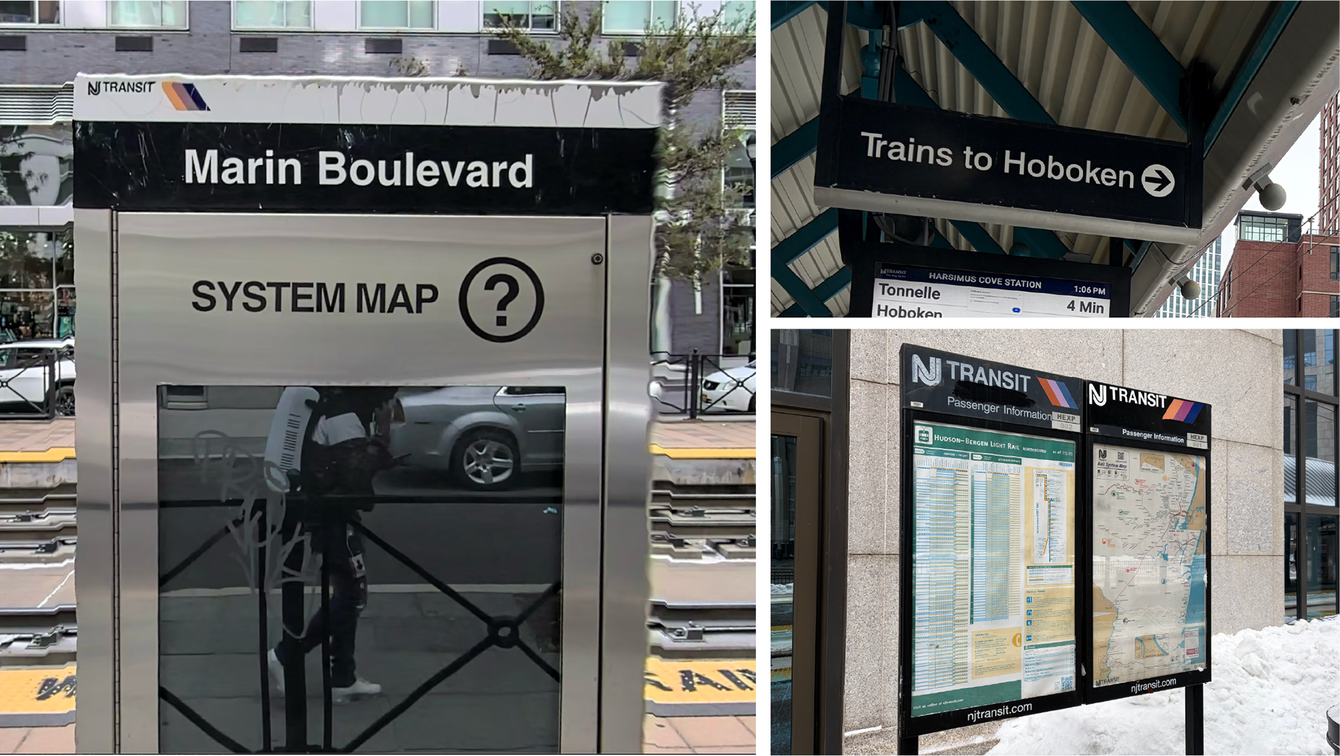
Signs are often implied rather than clearly communicated. Station name signs fail to indicate which lines they serve, while contradictory arrows create confusion. For example, some signs reading 'Trains to Hoboken' with an arrow pointing to the opposite platform leaves riders unsure: should they cross to that platform, or is the arrow merely pointing to the oncoming trains?
DESIGN INCONSISTENCY
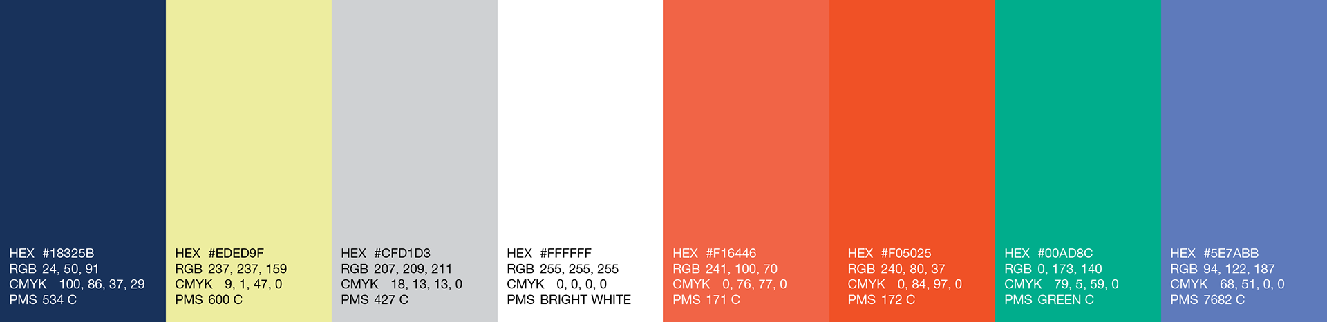
The current system suffers from a lack of visual cohesion. Design elements across stations, trains, and maps feel disconnected due to inconsistent color application and competing typefaces. This inconsistency is apparent in one of the most important parts about the rider's experience: the lines themselves, which are represented by different colors depending on the media, creating confusion rather than clarity.
OUTDATED MAP
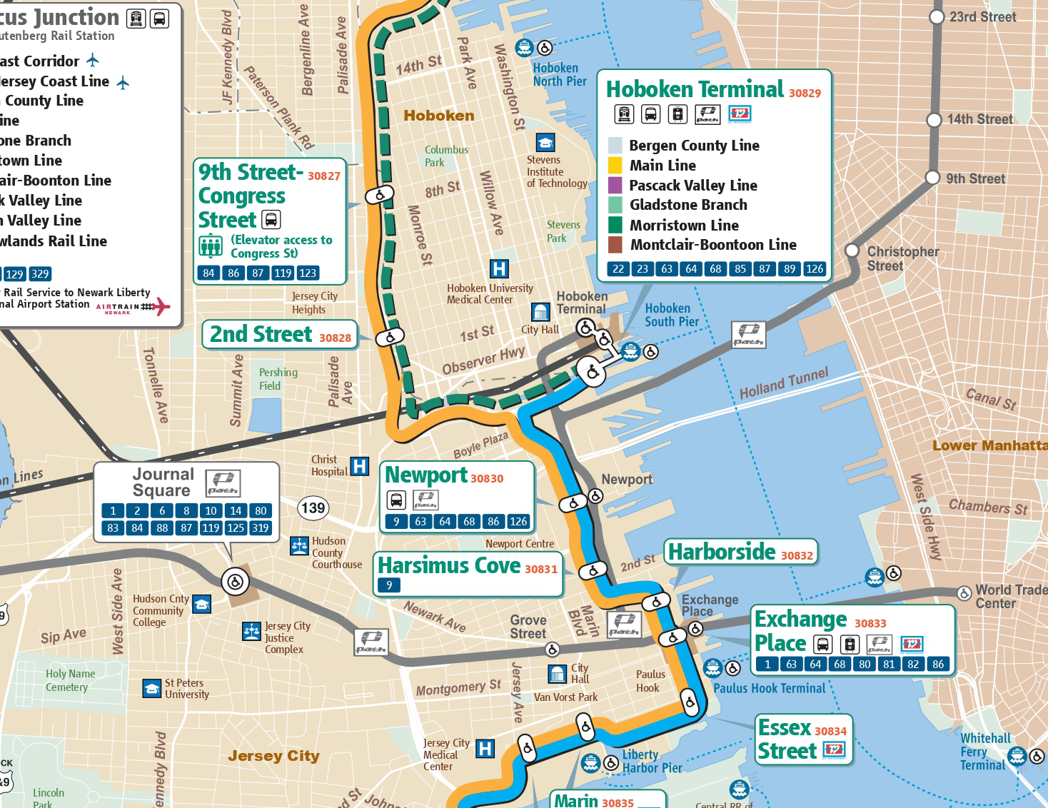
The official map displayed at stations is outdated and contains inconsistencies, such as mismatched station names in comparison to the signage. It also includes unnecessary geographic details that clutter the navigational experience. A critical oversight is the lack of integration with PATH and the NYC transit system, despite the city's proximity just across the river.
PROGRAMMING & PLACEMENT
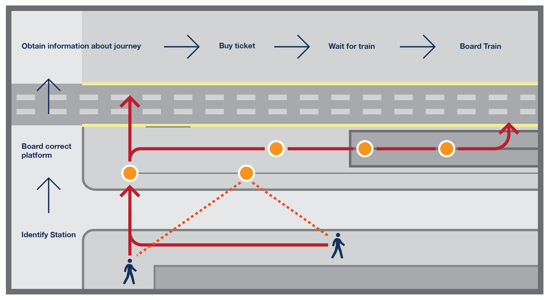
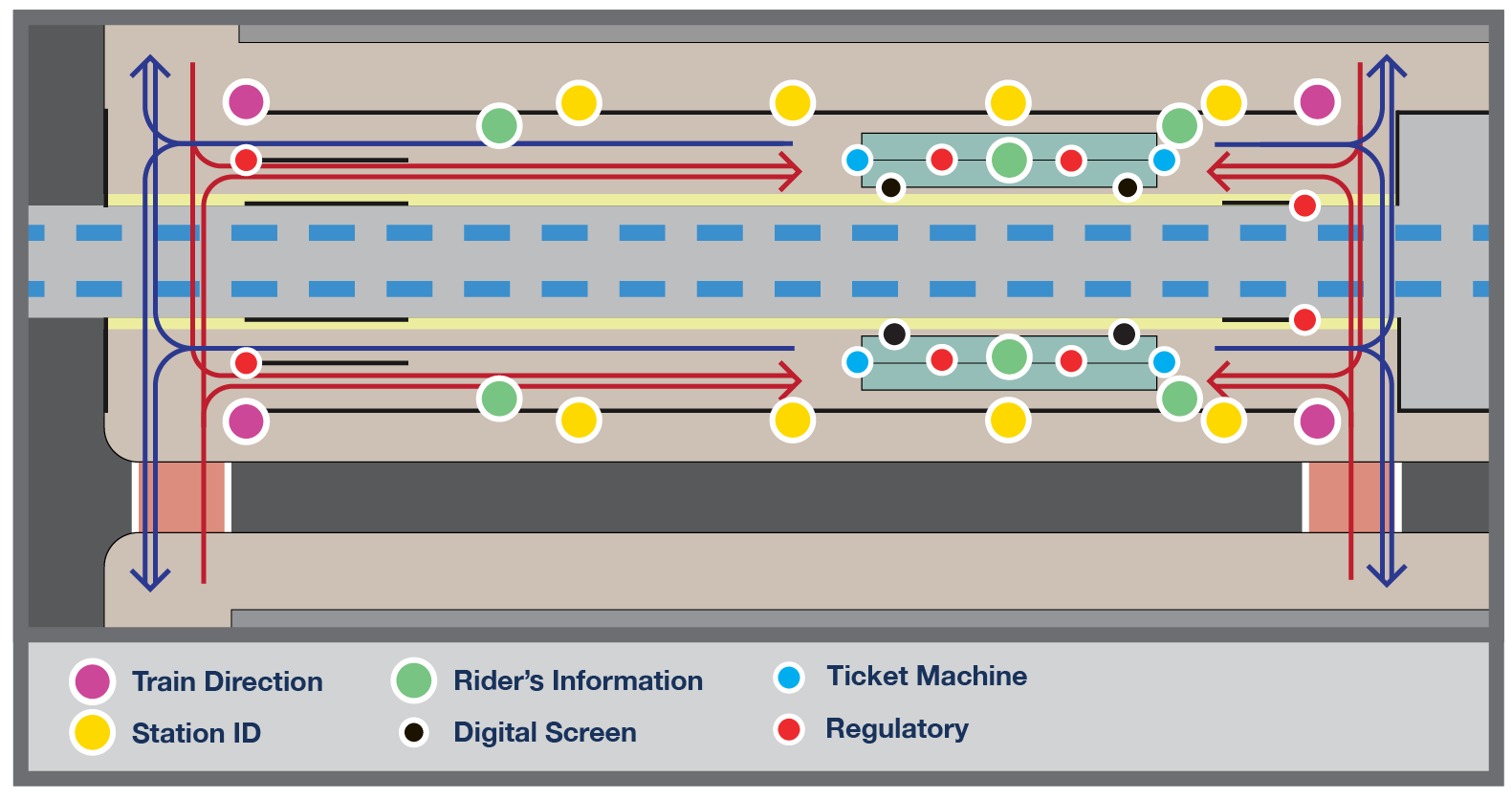
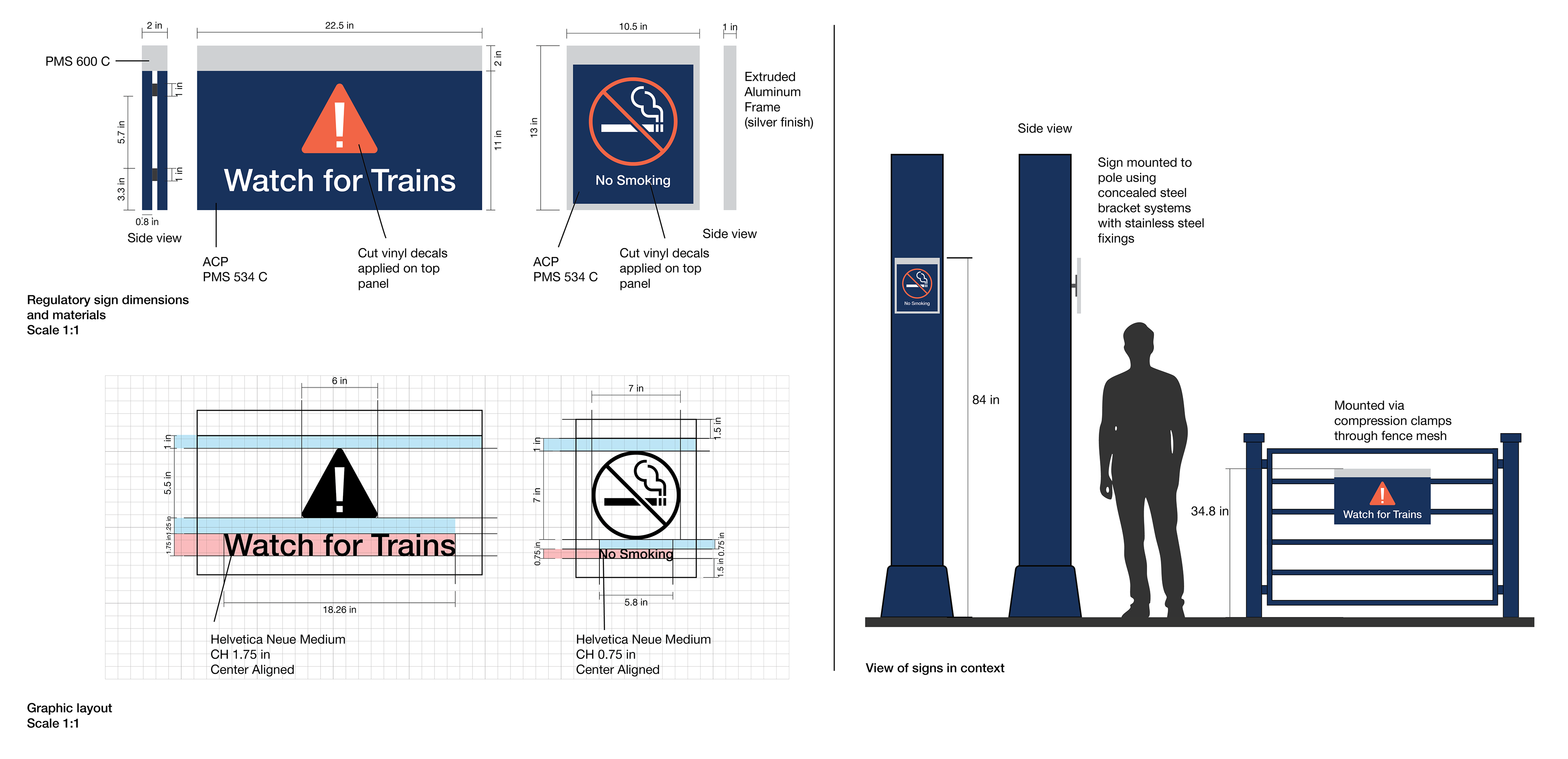
Sign placement was driven by decision-point analysis along the passenger journey. Every sign responds to a specific navigational need, with different types of signage: identification, information or reassurance. Full ADA compliance and universal design principles ensure the system serves every user equitably.
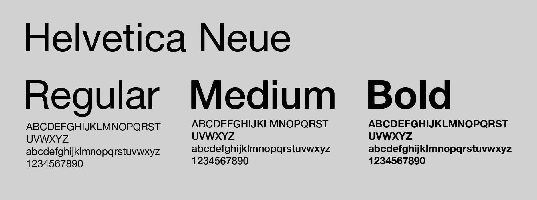
GRAPHIC STANDARDS

TRANSIT MAP
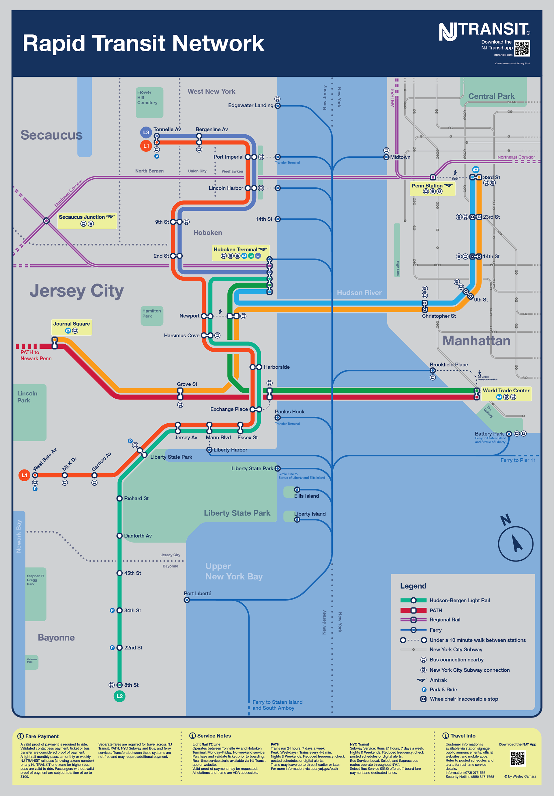
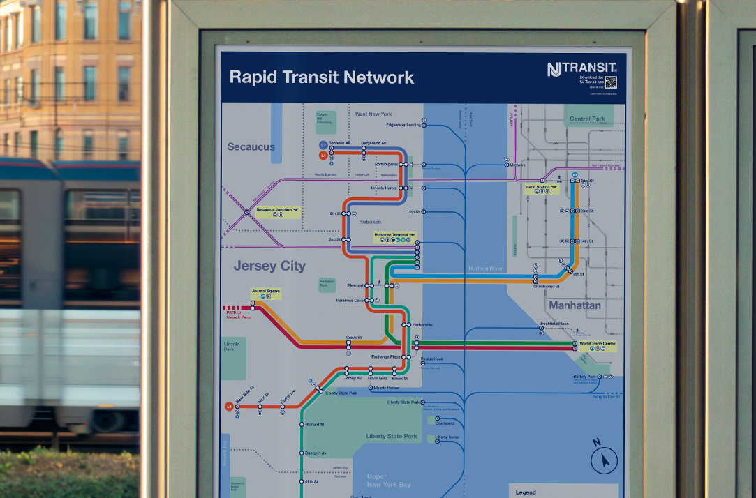
A cleaner, more intuitive map that display the same graphic elements of the signage. It functions more like a diagram since it is not completely geographically accurate (although it displays some landmarks). Passengers can now quickly orient themselves since every transportation mode has its own color and symbols and easily identify connections to PATH, NJ Transit, NYC Subway, and ferry services.
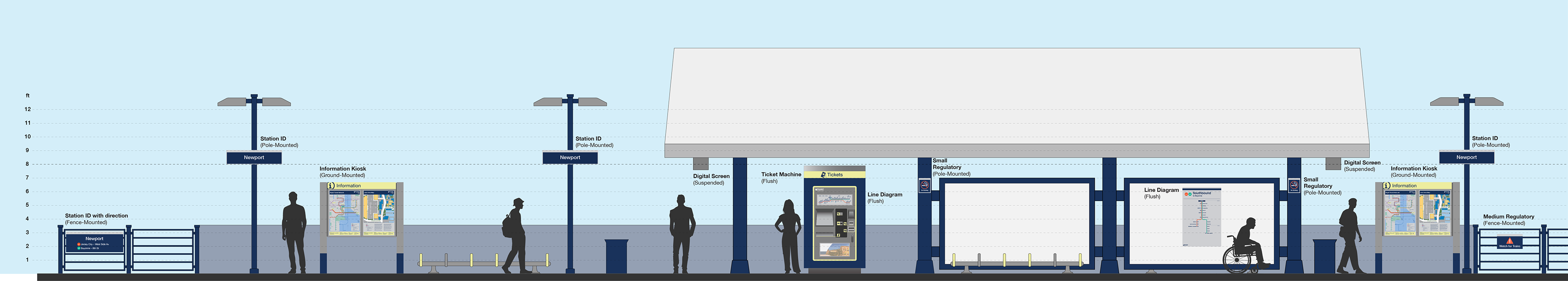
SIGN FAMILY
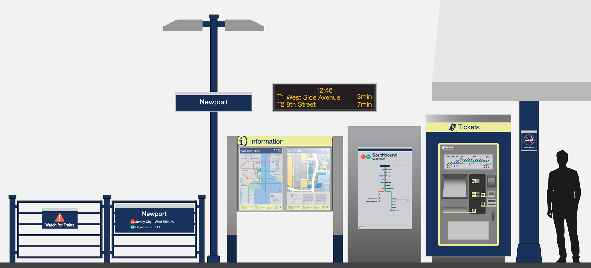
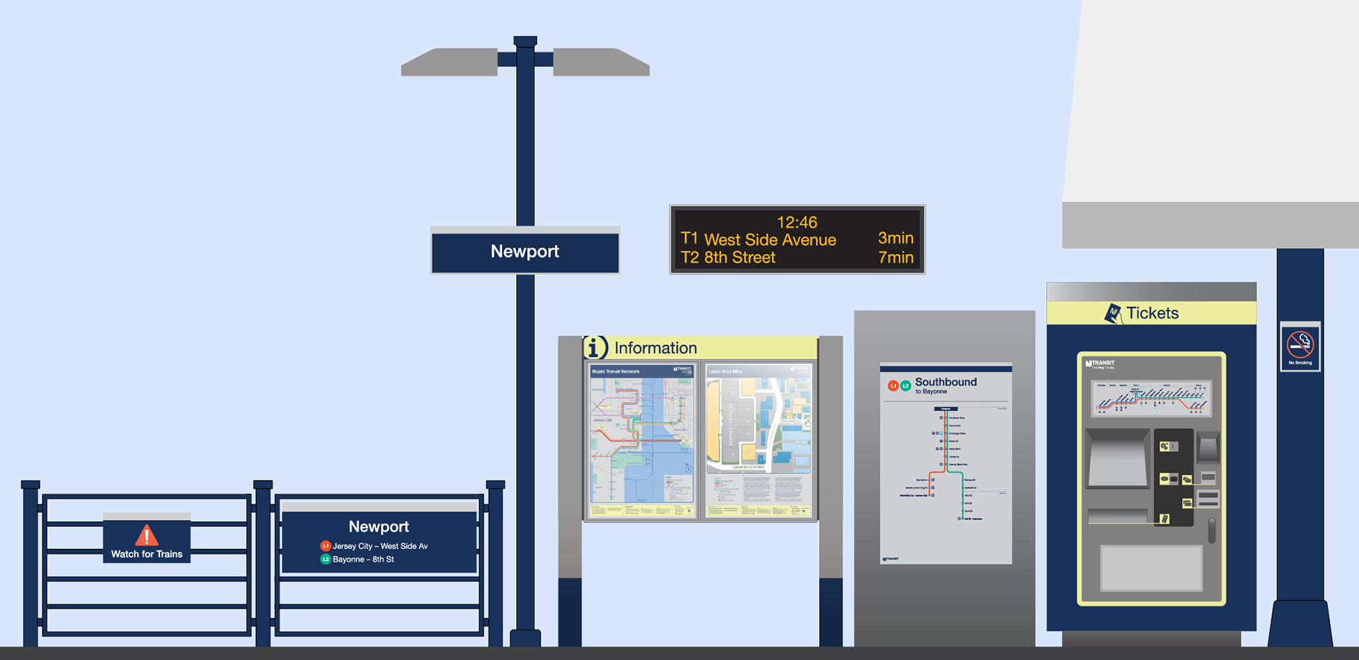
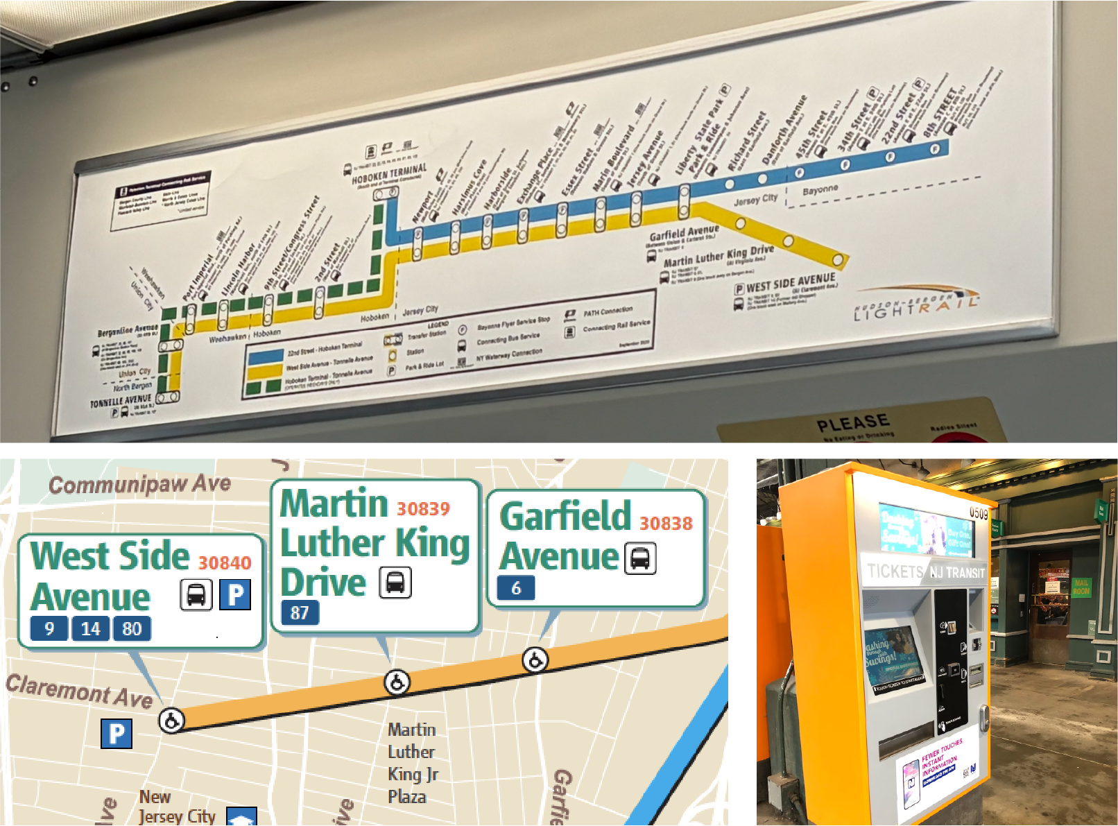
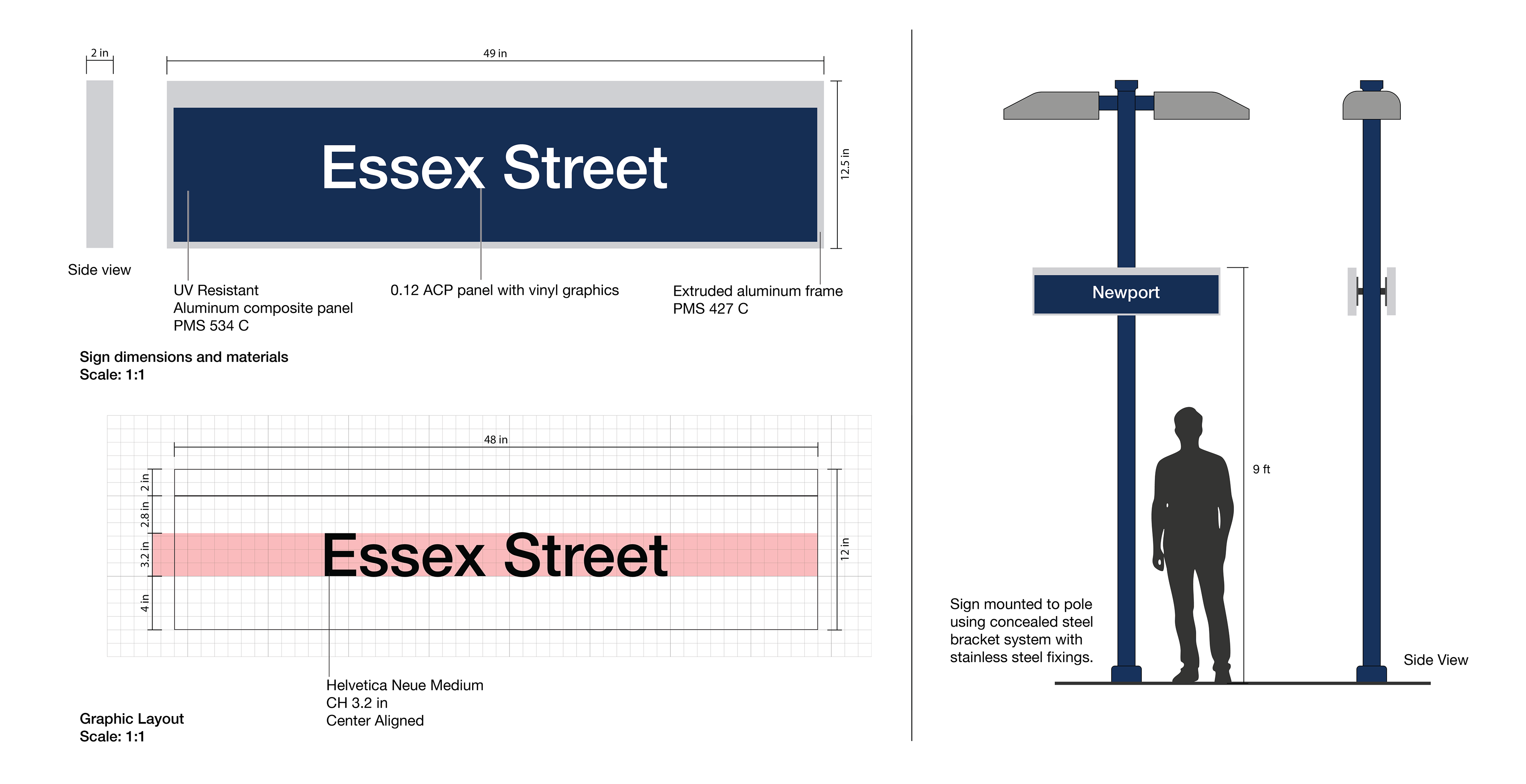
POLE-MOUNTED STATION ID
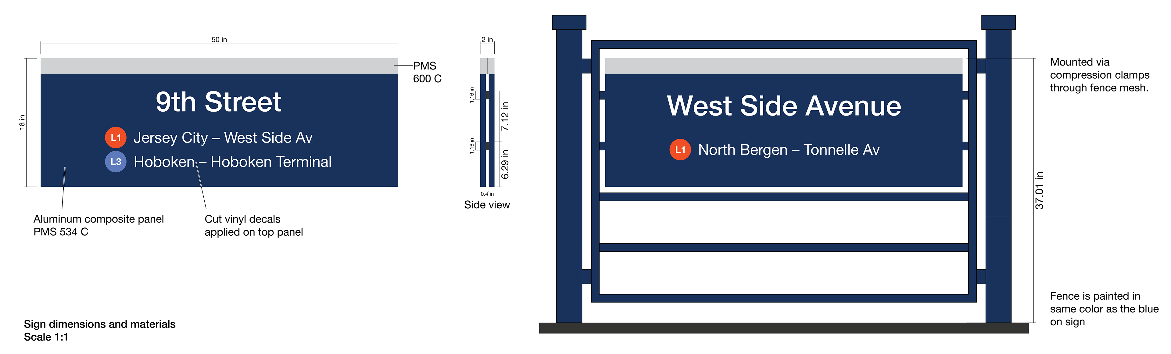
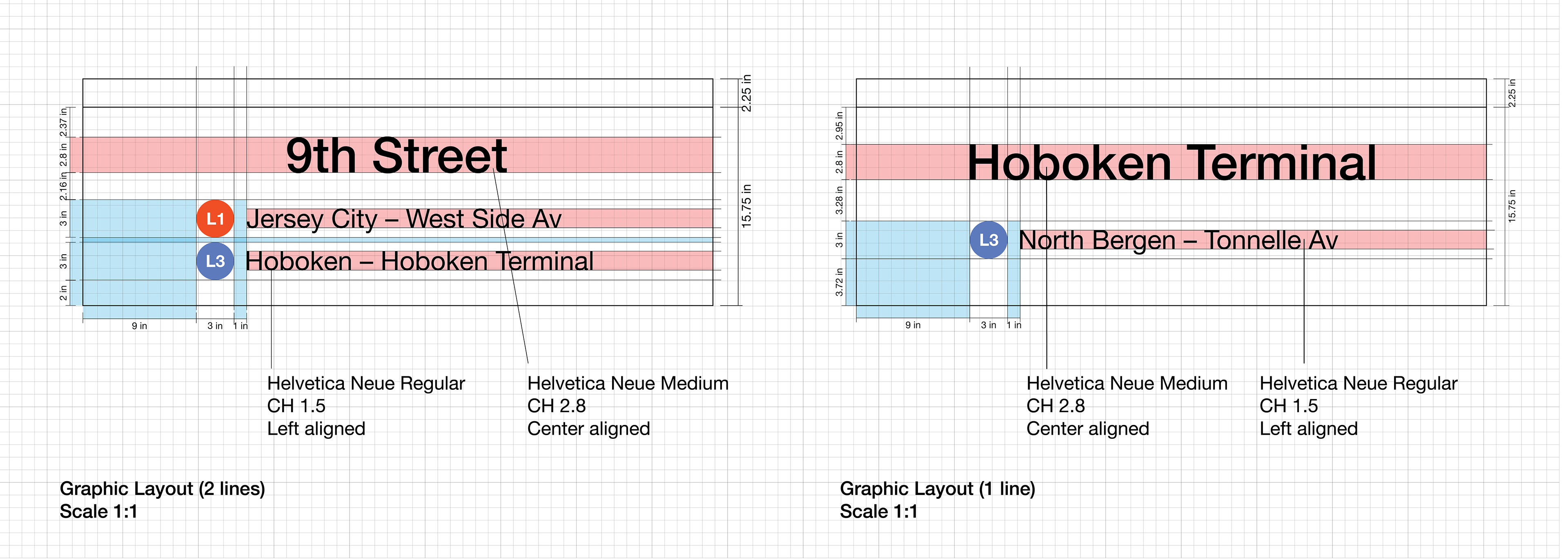
FENCE-MOUNTED STATION ID
Pre-platform decision signage. Located at station entrance, this sign communicates line assignments and train directions, enabling passengers to go to the correct platform in advance.
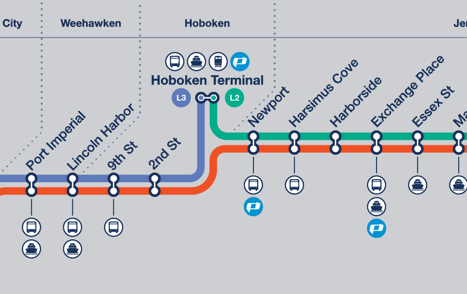
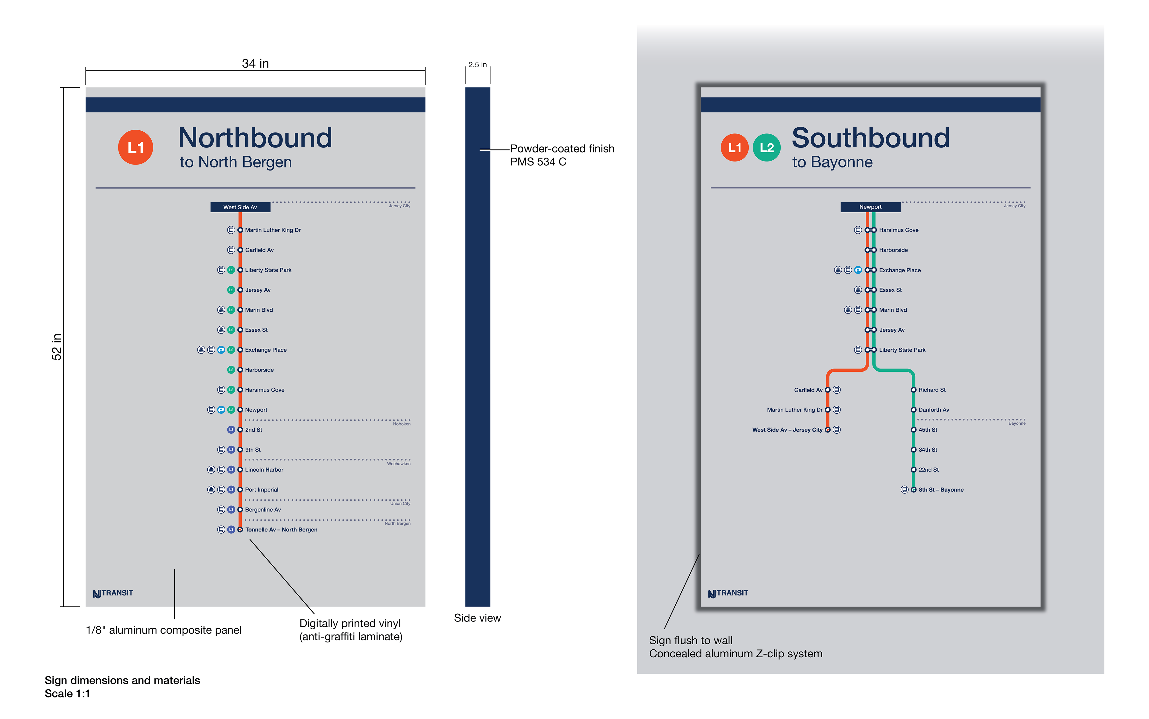
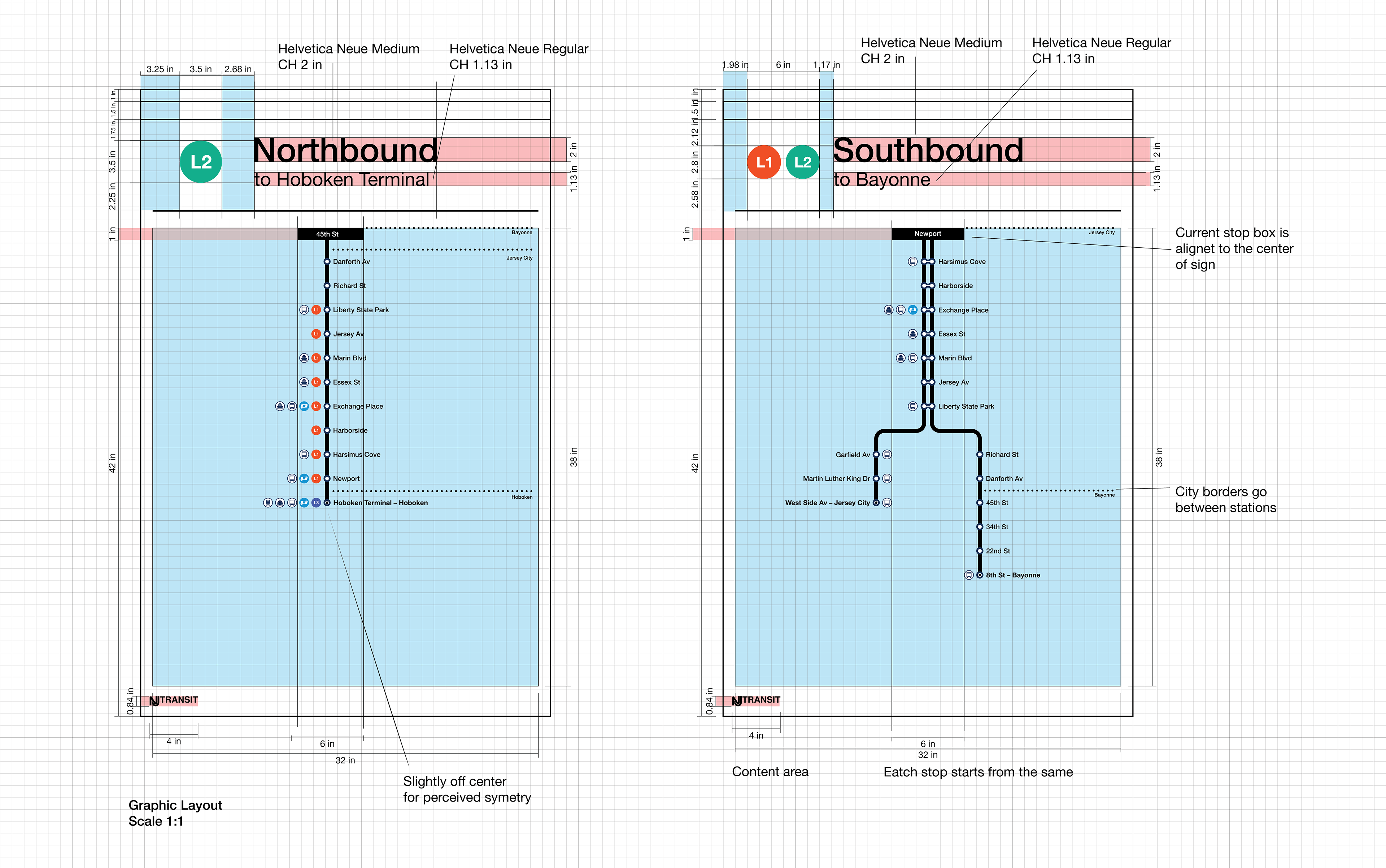
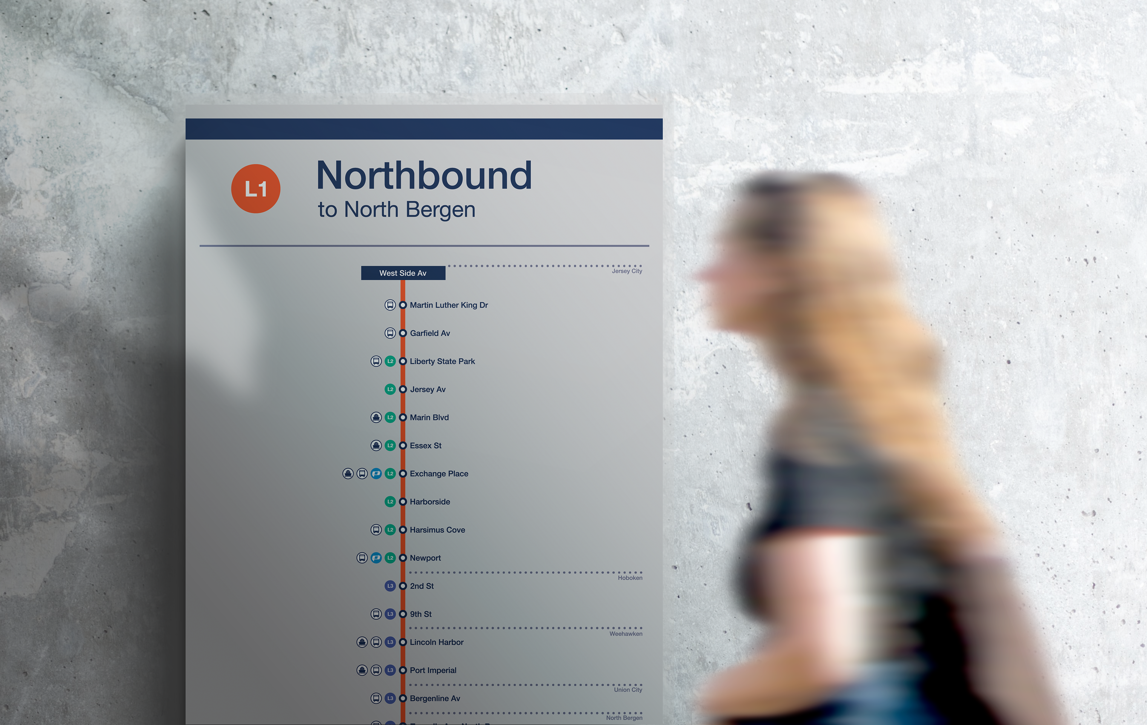
ROUTE DIAGRAM
Route diagram showing full station sequence from current location to terminus. Serves as a reassurance sign, allowing riders to verify their direction and anticipate upcoming stops. It also shows connections to other means of transportation and lines. Reduces anxiety and the need to ask for directions.
TICKET MACHINE
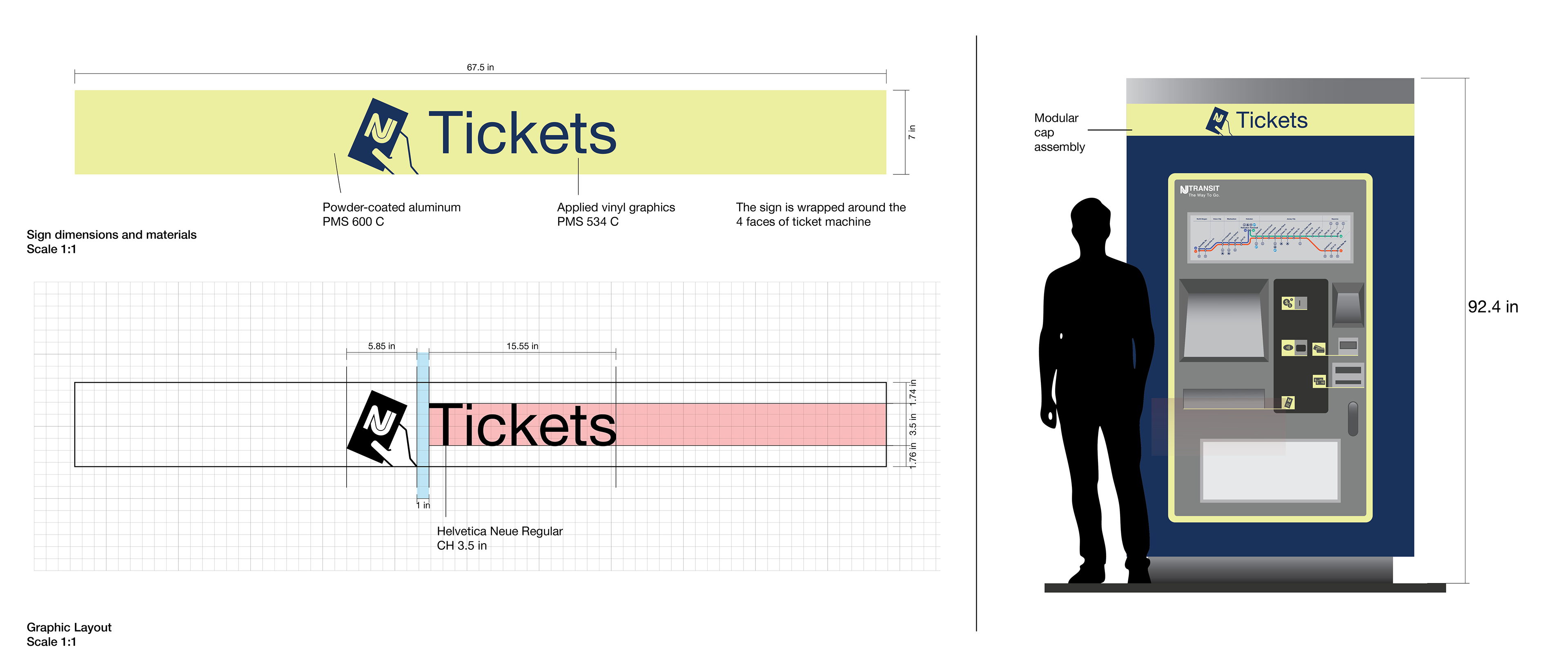
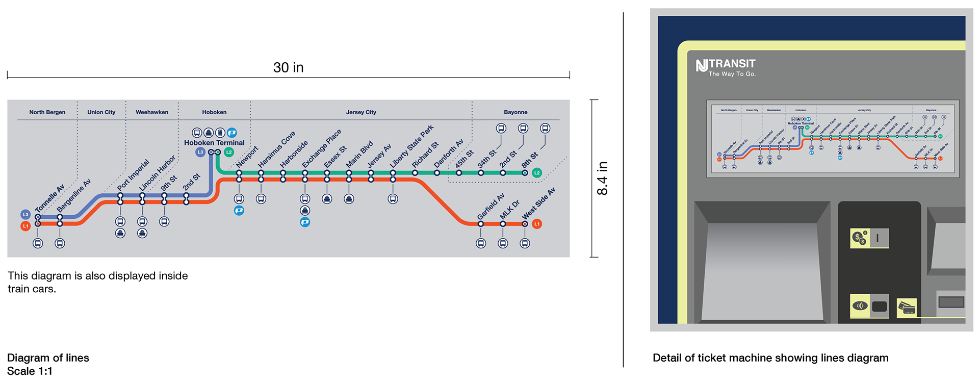
System diagram placed in aluminum frame with a weather-sealed polycarbonate front panel designed for protection while allowing quick updates by maintenance staff.
REGULATORY
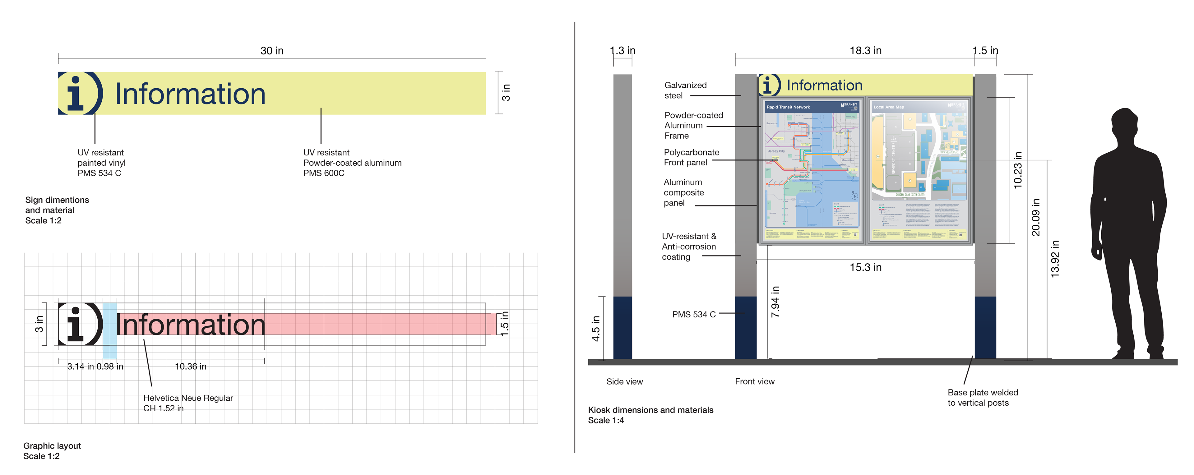
INFORMATION KIOSK
Dual-purpose Information Kiosk. For riders arriving at the station, it shows the transit network map for route planning and connections. For riders leaving the station, it displays the local area map for neighborhood orientation so they can continue their journey. Located near station exits.
The Hudson-Bergen Light Rail deserves a wayfinding system as essential as the service itself. This project resolves existing failures and establishes a clear, accessible language for navigation across rider experience.